30 Apr 2011
24 Apr 2011
Final print work
I will be testing these on acetate this week and plan to have a grid of 9 images displayed using a perspex poster holder within the window.
And my animation so far...
17 Apr 2011
12 Apr 2011
10 Apr 2011
Animation progress
I have been working on my animation, trying to get more change of pace and triggers of different feeling in it. It still requires a lot of work but i think i am getting the right contrasts now.
I have also been working on some words which i am going to incorporate as messages within the animation and my print work, mainly derived from reading news articles about apathy in the UK voting system:
Dialogue
Participation
Citizen involvement
Alienation
Mockery
Obligation
Trust
Disappointment
Disillusion
Gap
Authenticity
Integrity
Safe seat
Re-engage
Cynical
Disengaged
Scandal
Conspiracy
Legitimate protest
Disaffection
Indifference
Sceptical
I have also been working on some words which i am going to incorporate as messages within the animation and my print work, mainly derived from reading news articles about apathy in the UK voting system:
Dialogue
Participation
Citizen involvement
Alienation
Mockery
Obligation
Trust
Disappointment
Disillusion
Gap
Authenticity
Integrity
Safe seat
Re-engage
Cynical
Disengaged
Scandal
Conspiracy
Legitimate protest
Disaffection
Indifference
Sceptical
3 Apr 2011
Start of my final animation
I have started trying to compile all my short animations I have been working on into the final piece.
30 Mar 2011
In situ
These mockups show the animations presented on screens within the window of the space and surrounded by vinyl graphics. I would like to present my print work on acetate or perspex and hanged in a grid around the screens. I think this would play on the light from the window and the different colours coming through from the window graphics. This could also be lit up from below at night. I would also like to create an ad campaign which could be printed as newspaper or magazine ads and branded TV idents which would be displayed in a low glass case in front of this work.
Animation screengrabs
My FMP has changed significantly since I first pitched my idea. I would like to retitle it TURN A BLIND EYE and it will now predominantly look at aspects of today’s society and current news and their effect on the everyday person. The focus will be on world leaders and politicians who have a position of power and the work will hint at the flaws and abuses these powerful people can get away with, and how their decisions impact on the masses. Using black and white collage imagery juxtaposed with acid colour layers I hope to create visually stimulating and aesthetically pleasing work which on second glance reveals a darker message. It will be a mix of moving image work and then accented images from the animation presented as print work. The commercial aim of the work would be a TV/print ad campaign for a current affairs documentary series and so I would also like to present a series of idents and print ads to show the work in a real life situation.
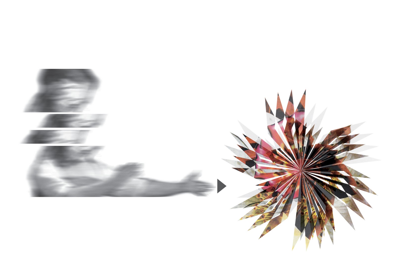
The series of short animations would be accompanied by audio taken straight from news reports and interlaced with typography using key words which I have pulled out of the reports or which I feel represents a feeling from hearing or watching the news. The bomb shapes are made up from collages of vintage rose photography in order to add the feel of “beautiful versus deadly.”
29 Mar 2011
FMP presentation
I would like to present my print work as small pieces rather than large format and in some sort of grid formation. Perhaps printed on acetate/perspex and lit from the back.
15 Mar 2011
FMP presentation
I have seriously started looking at how I am going to present my work at the show.
This presentation of the Grace Jones promo by why not associates on a grid of small screens is beautiful and i think my moving image work would work well in this layout. I don't think the circuit board and raw feel suits my work or objectives. But i think the small screens could accentuate the animation and the contrast between the different elements playing on each one.
I also like the idea of having a screen behind a laser cut screen which would allow the viewer to look at the animation but incorporate an extra level of shape, pattern through which they would see the moving image. I like these lantern sculptures by Mikyoung Kim Design. The laser cut stainless steel resembles a barcode and i love how the different colours shine through.
11 Mar 2011
Gallery visits
Today I went to Ikon to see Robert Orchardson's Endless Facade. I loved the shapes within Orchardson's sculptural pieces and the light and shade around the sculptures which changed as you walked around the pieces. I like the repeating quality of the shapes and the geometric patterns they create. I found this inspirational as i have been using geometric shapes within my work so far.
Then at BMAG I particularly liked this painting by Henri Fantin-Latour. I love the hues in this painting which are bright yet sad and almost funereal. The detail on the petals is amazing. I recognised this as the same artist which Peter Saville featured/reproduced on the cover for Power, Corruption and Lies. Saville used the classical and romantic painting and contrasted it with his modular, colourful coding.
I love the colours in this stained glass window by Henry Payne. I would like to use acetate to print some of my work and get these vivid and luscious tones.
I was intrigued by these pencil drawings by Kenneth Martin which represent kinetic structures and investigate movement. A simple square has been transformed into a number of different permutations.
10 Mar 2011
8 Mar 2011
Horrible v Beautiful
I have started work on some beautiful imagery to juxtapose the more sinister animations. I have made some collage from old books using pieces of photographed roses which have a great vivid colour/tone quality and then placed them within even more abstract shapes which resemble bombs or explosions. These shapes still fit with the geometric shapes contained within my other animations so i think these will compliment them and add extra colour to the work. Next i need to work at animating these and combining them with my other animations.
7 Mar 2011
More animation
Some more short animations and a crude test of how i would finally like it to look in a grid, the short pieces playing side by side.
22 Feb 2011
Politics
I have done a short animation commenting on how the parties within the coalition government have lost their identity and how Cameron and Clegg have merged into the same person.
2 Feb 2011
Type - Neil Kellerhouse
Today I have looked at the typography of Neil Kellerhouse which i have recently seen on film posters. I like the simple and direct quality of the type and how it works in an uncomplicated and fresh composition. As these are film posters the title of the film has to be direct where as i would look at something a little more subtle. I especially like the disappearing text on the I'm Still Here poster and how it fades into the image.
31 Jan 2011
Development work
I have been playing with the theme of 'turning a blind eye' and being led astray as a comment on how people can be deceived or horrible truths can be hidden by a government or by the restriction of unbiased media.
I was also really struck by a quote i read in the paper over the weekend commenting on poverty - "A fish rots from the head down, never from the tail up". I thought this was a really powerful way to explain why privilege and poverty persists in countries like India and Africa since there is not good political governance to ensure that aid is distributed fairly and properly and that those in need at the bottom of the chain are considered.
17 Jan 2011
Use of colour
I have been looking at the photography of Miles Aldridge and the work of Titian for inspiration on how to use colour. I love the acid tones in Aldridge's photos which make the models who are in very static and almost dead poses look alive and vibrant. I also like the selected use of colour and the highlights of 2 - 3 main colours.
I think the work of Titian is inspiring due to the use of so much colour in a complicated composition which does not detract from the piece, but which instead brings it together. I particularly like the use of blue and coral pink which stand out for me in this work.
Subscribe to:
Posts (Atom)